

Gray cabinets under a white quartz worktop is probably the most frequently built kitchen in the country right now. It is also, for such a safe combination, mismatched more often than almost anything else — and always for the same reason.
Match the gray to the veining, not to the white. The white field of a quartz slab is near-neutral and agrees with everything. The vein is where the colour lives, and it is the vein that will fight your cabinets if you let it.
Quartz veining comes in three broad temperatures. Cool grey veining, which is the most common. Warm taupe or greige veining, which is the second. And gold or bronze veining, which is a different decision entirely.
Slabs are almost always photographed under warm display lighting, and the vein temperature is the first casualty. Look at an actual offcut by a window if you can get one, and hold the cabinet door against it there.
A slab with grey veining wants a neutral or cool cabinet under it. Shaker Gray is the safest single answer, and Shaker Ash Grey if the room wants something lighter.
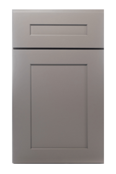
Putting a greige under grey veining is the single most common version of this mistake. It reads as two shades of gray that do not know each other, and once seen it cannot be unseen.
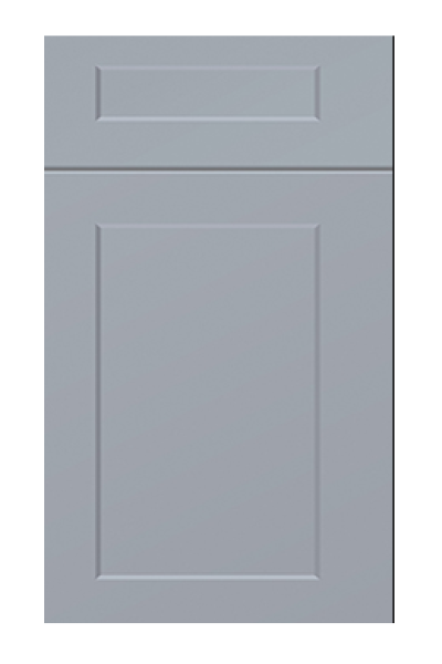
Taupe and greige veining is warmer than most people register, and it asks for a cabinet with the same warmth. Shaker Dove and Shaker Stone Wash both sit correctly here, and Oxford Cashmere where the room wants to go warmer still.
The same logic runs the other way: a cool gray under warm veining leaves the counter looking slightly yellow, which people then blame on the stone.
Gold and bronze veining is a strong decorative choice and it does not sit comfortably under most grays. It belongs above white, cream or wood, where it reads as luxury rather than as a clash.
If the slab is already bought and it is gold-veined, the honest advice is to move the cabinets to a warm white such as Shaker Antique White rather than to hunt for a gray that will work, because the one that works barely exists.
Light gray under white quartz gives a soft, quiet room and can look washed out if nothing else in the kitchen has weight. Dark gray under white quartz gives a strong horizontal line and is the more photographed of the two, but it needs the room to carry it.
The middle — a mid gray such as Shaker Gray — is the least dramatic and by some distance the most livable. If the kitchen is the only one in the house and it has to last, that is the one to beat.
With gray cabinets and a white counter, the backsplash is the third surface and it is where the scheme is either resolved or undone. Running the quartz up the wall keeps the counter reading as one continuous material and is the calmest option.
A tiled backsplash introduces a fourth colour and a grout line, both of which have temperature. If the tile is going in, choose it after the cabinets and against them, never from a separate sample board.
There is one detail that decides how expensive the whole combination looks, and it costs nothing to specify: the edge profile where the quartz meets the cabinet. A thin, square edge reads modern and lets the gray below dominate. A thicker or mitred edge turns the counter into a visible slab and pushes the cabinets into the background.
With a light gray, a heavier edge gives the room the weight it would otherwise lack. With a dark gray, a thin edge stops the lower half becoming one solid block. It is the cheapest lever in the room and it is usually pulled by default rather than on purpose.
Ask for the edge detail on the drawing before the slab is templated, because after templating it is no longer a choice.
Under a white quartz counter the sink is a bigger visual decision than it looks, because it sits in the middle of the pale field and every eye lands there. A stainless undermount reads cool and disappears into the scheme; a white composite disappears completely; a black composite becomes a deliberate dark point in the middle of the counter.
Whichever you choose, count it as a metal. Most kitchens end up with three — handles, tap and sink — and if all three disagree the room reads as assembled rather than designed. Two matching and one deliberate contrast is the usual resolution.
Against a gray such as Shaker Dove or Shaker Ash Grey, warm metals do the most work, because the counter is supplying all the coolness the room needs.
Slab first if it is already chosen, cabinets second, backsplash third, hardware last. Reversing that order is how people end up with three surfaces that each work individually and do not work together.
Bring an offcut of the quartz to the doors rather than a door to the stone yard — a warehouse gives you more usable daylight than a stone hall does, and you can hold three grays against it at once.
Every collection below is stocked at our Norcross, GA warehouse for pickup or delivery across metro Atlanta.

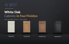

The gray is on the outside. Open a door and the box is natural wood veneer...
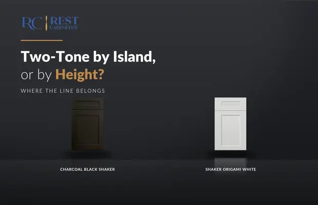
There are only two honest places to put the line. Everything else is a colour change...

Wood on the island is the two-tone that people who dislike two-tone kitchens still like.
Log in to see prices and place orders
Don't have an account? Register

