

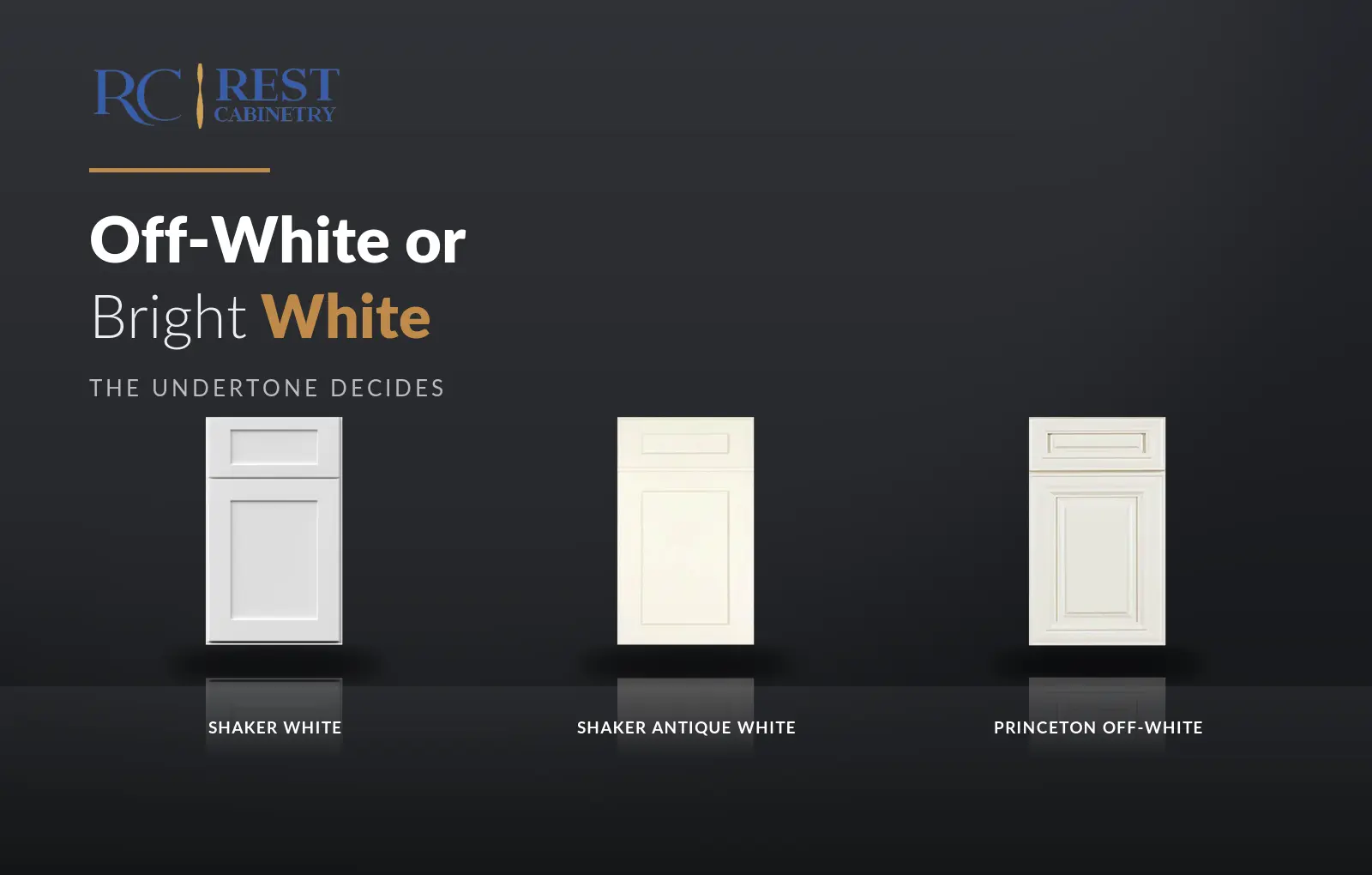
Ask for white cabinets and you will be shown a dozen doors that all look white until they are next to each other. Then they stop looking white and start looking blue, or yellow, or grey. This is how to tell which is which, and which one your room wants.
Bright white for a room with plenty of daylight and cool stone. Soft or off-white for almost everything else, because it is the one that stays looking like white under artificial light. Cream only where there is wood or brass in the room to answer it.
Bright whites carry a trace of blue, which is what makes them read as clean and crisp. Soft whites carry a trace of warm grey, which stops them turning clinical after dark. Creams carry yellow, which is warm in daylight and can go distinctly buttery under incandescent bulbs.
Every white on the market is one of those three. The name on the door tells you almost nothing about which.
Put a sheet of ordinary printer paper next to the door. Printer paper is aggressively neutral and it forces the door to declare itself: the bright whites look faintly blue against it, the creams look yellow, and the soft whites look very slightly grey or beige.
Do it in daylight and again at night. If a white swaps family between those two readings, it will go on catching you out once it is installed — far better to learn that now.
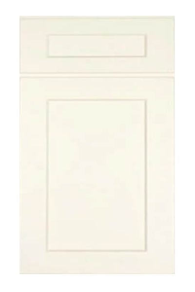
Strong southern daylight is warm, and it pushes a bright white toward neutral rather than blue — which is why a bright white that looks cold in a northern room can look right here. A north-facing kitchen gets the opposite treatment: cool light all day, and a bright white in it can tip toward grey.
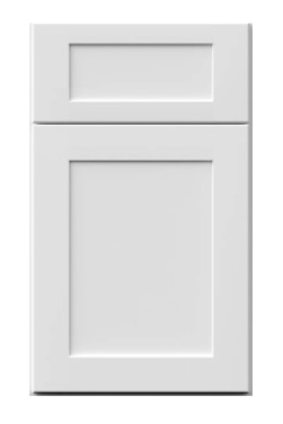
The practical rule for a north-facing room is to go one step warmer than the white you first liked. That is usually the difference between Shaker White and Shaker Origami White.
The mistake that costs the most is choosing the white first. Stone is far harder to change than paint and comes with its own undertone, so it should lead. A cool grey-veined quartz wants a bright or soft white above it; a cream or gold-veined stone wants an off-white, and putting a bright white against it makes the stone look dirty.
If the counter is already in, take a piece of it to the doors rather than the other way round.
At the cool end, Shaker White and Oxford White. In the soft middle, Shaker Origami White and Slim White. At the warm end, Shaker Antique White, Princeton Off-white and Princeton Creamy White Glazed.
Sixteen whites in total across the collections, which is what makes it possible to match a room rather than accept whichever white came with the door you liked.
The old advice was that white makes a small room look bigger. What it actually does is remove edges: with pale fronts, pale walls and a pale worktop the eye stops finding boundaries and the room reads as one continuous volume rather than a set of boxes.
That only works if the whites agree. A bright white cabinet against a cream wall creates exactly the boundary you were trying to lose, and the room ends up looking smaller than it did with one honest colour. In a small kitchen the discipline is to pick one white family and hold it across cabinets, walls and trim.
One more check people skip: the ceiling and the trim are almost certainly already white, and they were painted by somebody else. A cabinet white that is warmer than the trim reads as dirty; one that is cooler reads as stark. Hold the door against the architrave before ordering.
If the trim is being repainted anyway, this stops mattering and the room opens up.
There is a version of this decision where you do not have to choose. A warmer white on the island or the tall units against a cooler white on the perimeter is a real scheme, and it works precisely because the difference is small enough to read as depth rather than as contrast.
It is also the hardest two-tone to get right, and it is the one most likely to be read as an error rather than a decision, because a difference that small has nothing obvious to justify it. The rule is the same as for any two-tone kitchen: the change of white has to happen where the cabinetry changes, never in the middle of a straight run. Shaker Origami White against Oxford White is a workable pair; two whites from opposite temperature families is not.
Counter first, then trim, then the room’s light, then the door. In that order the choice usually makes itself, and the paper test settles any remaining doubt in seconds. All sixteen sit together at the Norcross warehouse, and side by side is the only condition under which their differences are visible at all.
The wider white range is set out in choosing between our whites, and the catalogue is in shop cabinets.
Every collection below is stocked at our Norcross, GA warehouse for pickup or delivery across metro Atlanta.



Shaker White carries 369 sizes, the most of any Shaker finish we hold. That range is...

Four finishes on one white oak door: a painted ivory, two stains and a black. What...

Wood on the island is the two-tone that people who dislike two-tone kitchens still like.
Log in to see prices and place orders
Don't have an account? Register

