


A white Shaker kitchen is what people choose when they are afraid of choosing wrong. That is usually meant as a criticism, and it is worth taking seriously as a compliment instead: a door profile that has outlived two centuries and a dozen colour cycles is not surviving by luck. Below is what the style actually is, how our three Shaker whites differ from one another, and the single question that settles which one belongs in your room.
Strip the marketing away and a Shaker door is four rails and stiles framing a flat, recessed centre panel. No moulding around the panel. No arch across the top. No applied ornament anywhere. The Shakers built that way because decoration was a vanity, and the shape their belief produced happens to be the most forgiving door profile ever drawn.
Forgiving in one specific sense: a flat rectangle reads correctly at any width. A narrow 9-inch unit and a 36-inch base wear the same door and neither looks stretched. Raised and arched panels do not behave like that — scale them up or down and the proportion goes visibly wrong. It is why a Shaker run of mixed widths looks deliberate while the same widths in a raised-panel door often look like a compromise you had to accept.
The whole Shaker collection here runs to 21 finishes and 6,463 individual cabinet sizes, which is what lets a mixed-width wall actually get built rather than designed and then value-engineered.
Every few years a colour is announced as the end of the white kitchen. Greige was going to do it. Navy was going to do it. Sage is being asked to do it now. None of them have, and the reason has less to do with taste than with light.
The kitchen is the room where you need to see what you are doing with your hands. Pale fronts bounce light back into the room instead of drinking it, and in a house with one window over the sink that is worth more than any amount of under-cabinet lighting. Plenty of the ranch and split-level houses around Gwinnett have exactly that kitchen: interior room, single window, north light. There, white is not a style argument. It is the difference between a room you cook in and a room where you reach for a lamp at two in the afternoon.
The second reason is duller and stronger. White is the finish the largest number of people can picture their own belongings inside. If there is any chance the house changes hands within ten years, that matters.
We hold three whites in the Shaker line, and they are genuinely different paints rather than three names for one colour.
Shaker White is the cleanest of them — a bright white with no warmth underneath. It is the one that photographs the way people expect a white kitchen to look, and it sits most naturally beside cool quartz and stainless. How to plan a whole kitchen in it is set out in Shaker White: a whole kitchen in one finish.
Shaker Origami White is a shade softer. There is a trace of warmth in it: enough to keep the room from reading clinical under LED downlights, not enough to call it cream. If you cannot decide between the three, this is the one that is hardest to regret.
Shaker Antique White is the warm one, built on a yellow-cream base. It belongs in a room with wood floors and brass, and it is the only one of the three that sits comfortably next to an existing oak floor instead of arguing with it.
Between them those three carry 1,015 individual cabinet sizes, which in practice means the door you like is very unlikely to be the reason a layout has to change.
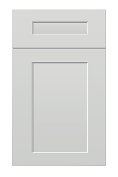
Shaker is a profile, not a colour, and white is a colour, not a profile. If white is settled but the flat panel is not the look you want, thirteen further whites sit across the other collections.
Sixteen whites in total. The useful consequence is that you are choosing a door and a white separately, instead of accepting whichever white came attached to the door you liked.
Undertone is the only part of this decision that a photograph cannot help you with, because every photograph was lit by somebody else. A white with a warm base turns faintly yellow under incandescent bulbs and settles down under daylight. A cool white does the reverse: crisp at midday, faintly blue and hospital-ish after dark.
So test the room, not the picture. Put the candidate against the wall where the cabinets will go and look at it at three moments — morning, mid-afternoon, and after dark with the lights you actually own. A north-facing kitchen already receives cool light all day, which is why a cool white in one can tip grey; the warm base of Antique White is usually the correction. A south-facing room takes the opposite advice.
The one thing worth being ruthless about: hold the white against the floor and the countertop that are staying. Two warm elements and one cool one is the most common way a kitchen ends up feeling slightly off without anyone being able to name why.
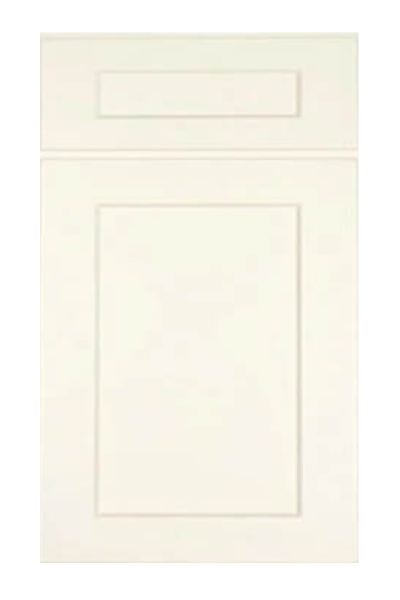
It shows dust along the top of the crown moulding, and it shows it from the doorway. It shows a greasy handprint by the range within a week. Neither of those is a reason to avoid white; both are a reason to plan for a wipeable finish and to accept that white asks for ten seconds of attention more often than charcoal does.
What it forgives is more valuable. Scuffs and knocks on a painted white door are close to invisible from any distance, where the same knock on a dark finish catches the light and announces itself. White also forgives a room that is not square, because the eye stops tracking lines when there is no contrast to track them by.
Longer term, a painted door is the one you can put right. A chipped corner on white can be touched in and lost; the same repair on a stain or a printed film cannot be hidden. The details of what sits behind the paint are set out in what is inside a kitchen cabinet box, and they matter more to how long the kitchen lasts than the colour ever will.
Every finish above is held at the warehouse on Jimmy Carter Blvd in Norcross, which is close enough for most of Gwinnett to look at three whites in one afternoon rather than argue about them from photographs. Bring a piece of your floor or a cut-off of the worktop if you have one; ten minutes with the real materials settles a decision that weeks of swatches will not. Details of what we cover are on the service areas page, and the rest of the range is in the cabinet catalogue.
Three in the Shaker collection - Shaker White, Shaker Origami White and Shaker Antique White - carrying 1,015 individual cabinet sizes between them. Thirteen further whites sit across the other collections, sixteen in total.
A soft or warm white rather than a bright one. A bright white in a north-facing room can tip toward grey, while the faint warmth in Shaker Origami White keeps it reading as white under both daylight and lamplight.
The door does not; the finish and the hardware do. A plain flat panel in a neutral white has stayed current through several colour cycles, and both the paint and the handles can be changed without replacing cabinets.
That is a property of the coating rather than the colour. Older oil-based lacquers amber as they cure; modern waterborne finishes do so slowly enough that most people never notice. Grease film above a range causes more visible yellowing than the paint does.
Every collection below is stocked at our Norcross, GA warehouse for pickup or delivery across metro Atlanta.

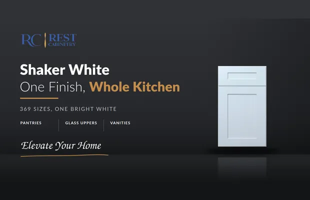
Shaker White carries 369 sizes, the most of any Shaker finish we hold. That range is...
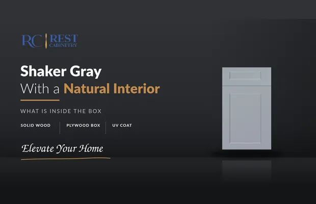
The gray is on the outside. Open a door and the box is natural wood veneer...
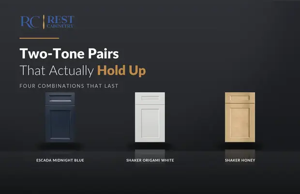
Most two-tone pairs are chosen from a photograph. Four of them survive a decade, and they...
Log in to see prices and place orders
Don't have an account? Register

