


Blue is the colour people choose when they want the kitchen to be something, and are not brave enough for green. That is meant kindly. Navy in particular sits in an unusual place: dark enough to anchor a room, familiar enough that nobody has to be talked into it, and old enough now that calling it a trend is stretching the word.
A neutral is a colour that does not argue with the things put next to it. Navy qualifies almost by accident, because it is so dark that the eye reads it as a shape before it reads it as a hue. Put brass on it and it turns traditional. Put chrome on it and it turns modern. Put oak beside it and it turns warm. Very few actual colours do that.
The lighter blues do not have that property. A mid blue is unmistakably blue in every light and against everything, which makes it a bolder choice than navy despite looking softer in the photograph.
Five finishes, 1,118 cabinet sizes between them, spread across four collections.
Escada Midnight Blue is the deepest of them and the closest to true navy. On the Escada door it reads as one continuous dark plane, which suits an island better than a full room. Slim Lakeside Blue sits at the other end: lighter, greyer, and easier to live with across a whole kitchen because it never becomes a hole in the wall.
In the middle sit the Shaker blues, and here the catalogue has a quirk worth knowing before you click. The Shaker line carries blue twice, under one name, in two different mixes — Shaker Blue with 272 sizes and Shaker Blue with 288. They are not the same paint. If you are choosing between them, that is a comparison to make with both doors in your hand rather than on a screen.
Matte Blue completes the set on a frameless front, where the absence of a frame lets the colour run without interruption across a run of tall units.
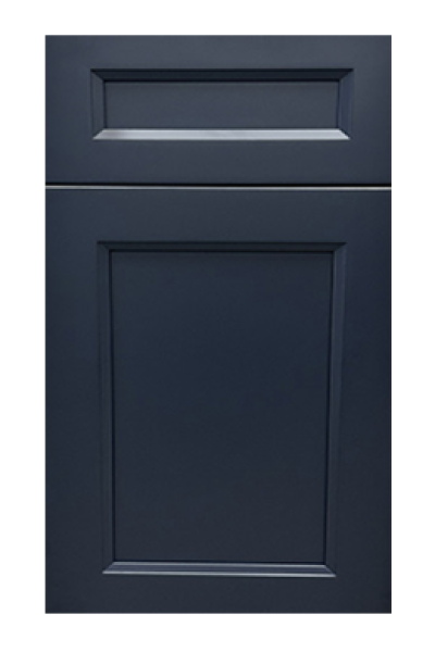
The island is the safest place, and it is safe for a structural reason rather than a timid one: an island stands apart from the run already, so recolouring it is describing the room rather than decorating it. A navy island under a pale perimeter is close to a default now, and it earns that.
The second place is the lower run, with something pale above. That puts the weight at the floor where the eye expects it, and keeps the reflective surfaces at eye level where a kitchen needs light. The rules for making that split read as deliberate are in where to draw a two-tone line.
A whole kitchen in navy works, but only with real window. In a single-window room it turns the space into an evening room at two in the afternoon.
Brass and unlacquered brass are the pairing everyone reaches for, and they work because warm metal against cold colour is a contrast the eye enjoys rather than resolves. Matte black hardware on navy is the quieter choice and almost disappears, which suits a busy room. Chrome sits between the two and dates the least.
For stone, a white quartz with grey rather than gold veining keeps the scheme cool and clean. A warm cream counter above navy is a harder pairing and usually needs wood somewhere else in the room to justify it.
This is the pairing that makes blue easy. Any wood floor, any wood island, any oak shelf gives the blue something warm to answer, and the room stops feeling cold immediately. Shaker Natural Wood or Shaker Honey on an island under blue perimeter cabinets is a scheme that survives changing taste better than blue with white.
Painted colour is repairable, which is the practical argument for choosing a strong one at all. Knock a corner off a navy door and it can be made good invisibly, since an opaque colour gives the repair nothing to line up with — the reasoning is in painted, stained or wood.
What blue does not forgive is dust and scuffing along the edges of a base run, which show pale against dark. That is a cleaning habit, not a design fault, and it applies to every dark finish.
Choosing it from a screen. Every other colour in a kitchen can survive being picked from a photograph badly; blue cannot, because screens render blue differently from one another more than any other hue. The navy that looked deep and slightly grey on a laptop turns up bright and slightly purple in a hallway.
The second version of the same mistake is picking blue against a counter that has not been chosen yet. Blue narrows the stone options more than a neutral does — a busy gold-veined marble above a strong blue is a fight neither surface wins. Settle the counter and the blue together, or settle the counter first.
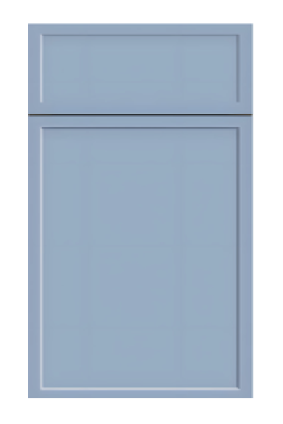
See the door in your own room, at night, under the bulbs you actually own. Blue shifts more between daylight and lamplight than any neutral does, and a navy that looked crisp in a warehouse can go slightly purple under warm LEDs. Every finish above is on the racks in Norcross, and the two Shaker blues in particular are worth putting side by side.
Then check the layout against the sizes: at 1,118 across five finishes, blue is well stocked but not as deep as the neutrals, so an unusual width is worth confirming early. Start from the standard size grid, and browse the range in the cabinet catalogue.
Every collection below is stocked at our Norcross, GA warehouse for pickup or delivery across metro Atlanta.




Four finishes on one white oak door: a painted ivory, two stains and a black. What...

Most two-tone pairs are chosen from a photograph. Four of them survive a decade, and they...
Greige and gray look identical on a screen and behave nothing alike in a room. One...
Log in to see prices and place orders
Don't have an account? Register

