

Two colours in one kitchen either look considered or look like the budget ran out halfway up the wall. The difference is not the colours. It is whether the line between them lands somewhere the room already had a line.
A kitchen is not one surface. It is a floor-level band you bump into and store heavy things in, and an eye-level band you look straight at. Those two bands already do different jobs, and giving them different weights simply agrees with what the room is doing.
That is also why the most common version — darker below, lighter above — feels natural rather than fashionable. Weight at the bottom is what the eye expects from any object, from a building to a bookcase.
What these have in common is that the colour changes where the cabinetry itself changes. A split placed in the middle of an unbroken run has nothing to justify it, and the eye reads it as an error every time.
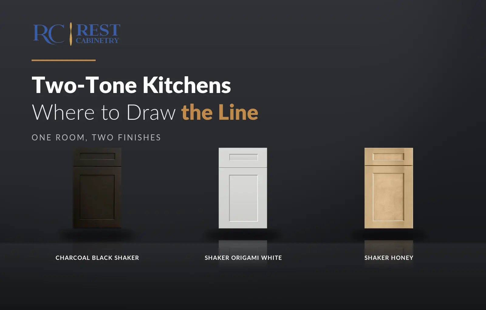
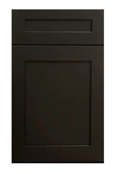
The dark finish carries the room, so pick it first. Shaker Dark Gray is the most forgiving, dark enough to read as deliberate without swallowing light. Shaker Vintage Charcoal and Charcoal Black Shaker go to the near-black end, where the finish stops being a colour and becomes a silhouette.
Colour, rather than depth, is the braver route. Escada Midnight Blue and Shaker Blue both read as navy in most light, and navy behaves almost exactly like a dark neutral while giving the room something to remember. Shaker Jade Green and Shaker Ivy do the same in green, which sits more easily beside wood.
The pale finish has one job: to disappear. That argues for the least eventful white you can find rather than the most interesting one. Shaker Origami White is the usual answer because its faint warmth stops the contrast turning stark, and Shaker Dove softens the step further where full contrast feels like too much.
If the dark half is warm — a green, a brown, a wood — then Shaker Antique White keeps both halves in the same family. Pairing a warm dark with a cold white is the single most common way a two-tone kitchen ends up looking unresolved.
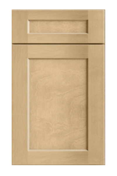
Wood is the quietest way to do this, and the hardest to get wrong, because grain reads as texture before it reads as colour. Shaker Natural Wood against a painted white gives you contrast without any colour argument at all. Shaker Cotton Oak is paler and works where the room is already busy, and Obsidian Oak takes it to the dark end while keeping the grain.
A wood island under a painted perimeter is close to a default in new Atlanta builds for exactly this reason. It photographs well, it dates slowly, and it forgives a floor you cannot change.
People plan two tones and then install three, because the worktop is a finish too and it usually gets chosen last. In a two-tone kitchen the counter is doing more work than in a single-finish one: it sits exactly on the line between the two halves, so it either resolves the change or draws attention to it.
The safe move is a counter that belongs to the lighter half. A pale worktop above a dark base reads as a continuation of the upper band, and the dark cabinets become a plinth the whole kitchen sits on. Run a dark counter on a dark base instead and the lower half becomes a single heavy mass, which can be exactly right in a large room and oppressive in a small one.
Three ways. Too little contrast, which reads as a mismatch rather than a choice — if two finishes are close, the eye assumes one of them is wrong. Too many finishes, where a third colour on the pantry turns a plan into a patchwork. And a split that ignores the room, most often a colour change that stops in the middle of a wall because that is where the cabinets happened to end.
The test is simple: if you can explain the line in one sentence, it works. “The island is different” is a sentence. “It changes after the third door” is not.
Which finish carries the room and which disappears. Where exactly the line falls, marked on the plan rather than decided on the day. Whether the counter, the hardware and the floor are all on the same side of the warm-cool divide as the finishes you have chosen. And whether both finishes cover every unit you need — each carries its own size range, so the run has to be checked against both, not one.
Every finish named above sits within a few feet of the others in Norcross, and putting two doors side by side on the counter for thirty seconds is worth more than a week of comparing photographs. Browse the full range in the cabinet catalogue, or start with how undertone works if the darker half is still open.
Every collection below is stocked at our Norcross, GA warehouse for pickup or delivery across metro Atlanta.

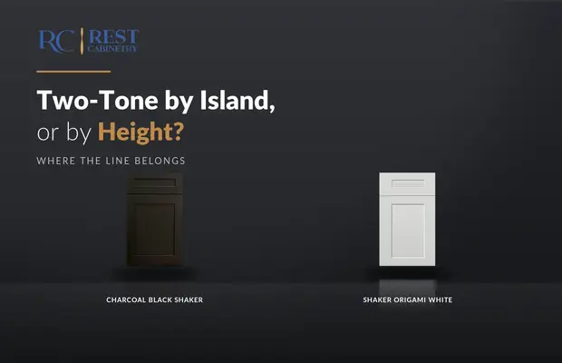
There are only two honest places to put the line. Everything else is a colour change...
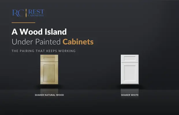
Wood on the island is the two-tone that people who dislike two-tone kitchens still like.

Most two-tone pairs are chosen from a photograph. Four of them survive a decade, and they...
Log in to see prices and place orders
Don't have an account? Register

