


Almost any two finishes can be put in a kitchen. Rather fewer still look deliberate after five years. These are the pairings that keep working, and the reason they do is the same in every case.
A pairing lasts when one finish is a neutral and the other is either a wood or a very dark colour. Two mid-tone colours together is what dates; a neutral plus an anchor does not.
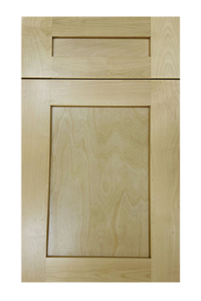
The most reliable combination available, and the least fashionable-sounding. Grain is not a colour, so it never competes with the white, and wood has been next to painted timber in kitchens for two centuries without either looking wrong.
Shaker Natural Wood or Shaker Cotton Oak on an island, with Shaker Origami White or Shaker White around the perimeter. If you want one recommendation and no further reading, this is it.
High contrast, low risk. A near-black finish reads as a shape rather than a colour, which means it behaves like a neutral even though it is dramatic.
Charcoal Black Shaker or Shaker Vintage Charcoal below, with a warm white above. The warmth in the upper finish is what stops the room going stark; a cold white against charcoal is the version that photographs well and lives coldly.
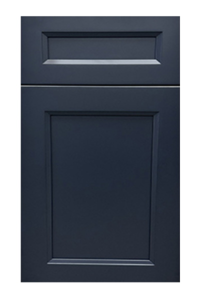
Navy is the one strong colour that behaves like a dark neutral, and it has already outlasted several colours that were supposed to replace it.
Escada Midnight Blue or Shaker Blue on the island against Shaker Antique White. The off-white matters here: navy with a bright white is a nautical cliché, navy with a warm white is a room.
The newest of the four and the one with the shortest track record, but it has the same structure — a muted colour against a warm neutral, with nothing competing.
Oxford Sage or Haven Sage with a cream or off-white. Greens sit naturally beside wood too, which makes this the easiest of the four to extend into a three-material room without it becoming busy.
In every case one finish is doing nothing. It is a neutral whose entire job is to let the other one be seen. The moment both finishes are trying to be interesting, the room has two subjects and no background, and that is what people are reacting to when they say a kitchen looks busy.
It is also why these pairings survive: the neutral half can stay while the anchor half is repainted in ten years, and the kitchen is renewed rather than replaced.
Two mid-tone colours, such as a mid grey with a mid green. Both are competing and neither wins, and the room reads as unresolved from the first day.
Two finishes from different temperature families — a warm cream beside a cool grey. It is the most common mistake of the lot, and the hardest to catch in advance, because the whole selection process happens on devices that cannot show it.
And any pairing where the two are close in depth. If the two finishes are within a shade of each other the room does not read as two-tone; it reads as one colour that went wrong somewhere.
Set both doors together, walk back a couple of paces and half-close your eyes. Two shapes still visible means the contrast carries. One blurred shape means the pair sits too close to be worth the trouble.
Repeat it at night beneath your own lighting, since a temperature clash shows itself only when daylight has gone. A pair that survives both readings will survive the kitchen.
Once a pair is chosen there is still a decision left, and it is often made backwards. The anchor finish belongs where the room needs weight, and the neutral belongs where the room needs light.
In practice that nearly always means the darker or the woodier of the two goes below the counter or on the island, and the neutral goes on the wall run. Reversing it — dark above, pale below — is not forbidden but it fights how a room is lit and how the eye expects mass to sit, and it needs a genuinely tall, bright space to work.
The one common exception is a wall of tall units treated as a piece of joinery. There the dark finish can run full height, because the unit reads as a single object rather than as a band.
Black and wood is the combination people expect to see on this list, and it is deliberately not here. It works, and it is spectacular in the right room, but it has no neutral in it — both halves are anchors. That makes it the one pairing on this page that depends entirely on the room having enough daylight and enough space.
If the room has both, Charcoal Black Shaker with Shaker Natural Wood is as good as a kitchen looks. If it has one or neither, the same two finishes produce a room that feels closed in within a month, and no amount of lighting fixes it.
That is the difference between a pairing that holds up and one that holds up in a photograph.
Both finishes have to cover the units the layout actually needs. Ranges differ between finishes, and it is entirely possible to choose a pair where one of them is short for the one width the plan depends on.
Check the two finishes against the plan, not against each other, before the pairing is settled. It is the least romantic step in this article and the one most likely to change the answer.
Every collection below is stocked at our Norcross, GA warehouse for pickup or delivery across metro Atlanta.


There are only two honest places to put the line. Everything else is a colour change...

Wood on the island is the two-tone that people who dislike two-tone kitchens still like.

A two-tone kitchen fails in five predictable ways. All five are visible on paper before anything...
Log in to see prices and place orders
Don't have an account? Register

