

Two-tone kitchens go wrong in a small number of very consistent ways. Each one is avoidable, and each has a check that takes a minute. Here they are in the order they cost the most.
Too little contrast, a line in the wrong place, mismatched undertones, a third colour, and a counter that belongs to neither half. Those five account for nearly every disappointing result.
Two finishes close in depth do not read as a scheme. They read as one colour that varies, which the eye interprets as a fault — a batch difference, a fading, a repair.
The check: stand the two doors together, step back six feet and let your eyes go soft. If they merge, the pair is too close. It is far better to be too bold here than too subtle; a strong contrast is always read as intentional.
The colour must change where the cabinetry changes: at the island, at the counter line, or at a physical break in the run. A colour that changes partway along an unbroken wall has nothing explaining it.
The check: explain the join aloud in one clause. “Because it is the island” explains it. “Because that is where we ran out of the first colour” does not, and that is what a visitor will read from it.
Cream on one side, cool grey on the other. Each finish is good; together they are not, and a monitor will never show you why, because a screen renders both as simply pale.
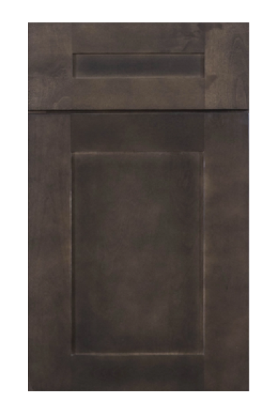
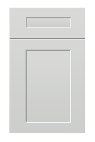
The check: printer paper. Hold both doors against it in daylight. If one leans yellow and the other leans blue, they will fight in the room no matter how well they photograph together. Keep both on the same side of neutral — Shaker Antique White with Shaker Honey, or Shaker White with Shaker Cinder, rather than one from each.
Two-tone becomes three-tone almost by accident: a different pantry, a hood in a fourth finish, open shelving in a fifth. Each addition was reasonable on its own and the result is a patchwork.
The check: count the finishes on the drawing, including the hood and any open timber. Three is the absolute limit and only in a large room. If a third is genuinely wanted, make it a material rather than a colour — timber such as Shaker Cotton Oak reads as material and does not count against you the way a third paint does.
Where the split runs horizontally, the worktop lands precisely on the join, which forces it to side with the upper half or the lower one. A counter that matches neither leaves a stripe through the middle of the room with no relationship to anything.
The check: put the counter sample directly between the two doors. It should look like it belongs to the top half or the bottom half. If it looks like a third thing, it is one.
Every failure above shares a cause: the second finish was chosen before the reason for it. Somebody saw a two-tone kitchen, liked it, and then worked backwards to find somewhere in their own room to put a second colour.
Working forwards produces different answers. A dark room needs light at eye level, so the lower band goes dark. An island facing a living space needs to read as furniture, so it takes the second finish. Both of those decisions arrive with the line already in the right place, because the room chose it.
Finishes such as Shaker Dark Gray and Shaker Origami White are then a shortlist rather than a starting point — which is the correct order and the one that makes the other five checks nearly redundant.
Worth saying: deciding against two-tone is not a failure. A kitchen in one finish, well chosen, is never wrong and it removes every problem above. Two-tone is a way of solving a specific issue — a room that needs weight at the bottom, or an island that needs to read as furniture — and where neither issue exists, the second colour is decoration.
If you cannot answer the question “what is the second finish for?” in one sentence, the honest answer is that one finish will look better.
Both doors. A counter sample. A floor offcut. A sheet of printer paper. And the drawing with every finish marked on it, hood included. If the pair is still open, Shaker Origami White with Shaker Natural Wood, or Shaker Dove with Shaker Dark Gray, are two shortlists that survive all five checks.
Those five items catch all five failures in about ten minutes, and they catch them at the only stage where fixing one is free.
Of the five, undertone is the failure people are least able to predict, because every stage of choosing works against them. Screens flatten temperature. Retail lighting is warm. Samples are looked at one at a time rather than together. And the two finishes are frequently chosen weeks apart.
The result is two doors that each looked right in isolation and disagree in the room. It is also the failure that is most often blamed on the manufacturer, when nothing was made wrong — a warm finish and a cool one simply cannot be reconciled by anything downstream.
The defence is boring and it works: choose both finishes in the same ten minutes, in the same light, against the same sheet of paper. Anything else is guessing with two variables at once.
Contrast and undertone problems can sometimes be pulled back with hardware and with the backsplash, both of which are cheap relative to cabinetry. A line in the wrong place cannot be fixed by anything except moving cabinets.
Which is why the placement question deserves the most attention and usually gets the least. Decide where the line goes before deciding what colours sit either side of it.
Every collection below is stocked at our Norcross, GA warehouse for pickup or delivery across metro Atlanta.

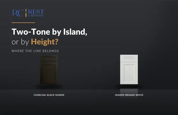
There are only two honest places to put the line. Everything else is a colour change...
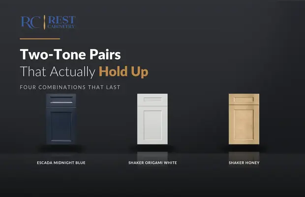
Most two-tone pairs are chosen from a photograph. Four of them survive a decade, and they...
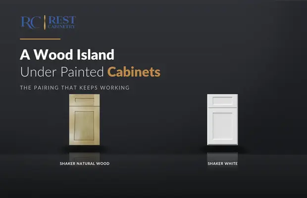
Wood on the island is the two-tone that people who dislike two-tone kitchens still like.
Log in to see prices and place orders
Don't have an account? Register

